A Pangea Mobile App
Real-time data has never been so easy to integrate and get your hands on. In this article, we share how we built an iOS app with Pangea's real-time data in less than one week! The best part, now you can too!
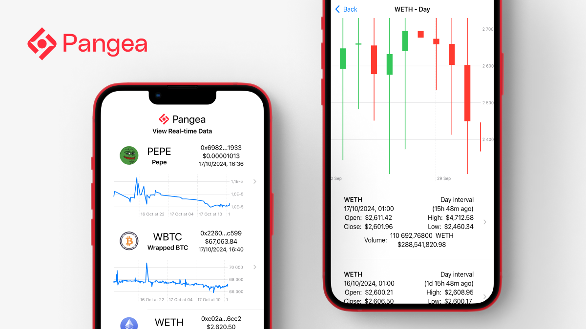
Pangea is about fast blockchain data. Data isn’t meaningful unless it can tell a story, and since people tend to be visual, a picture is the best kind of story.
In this article, we create a mobile app to take Pangea’s aggregated data and present it visually. Since we had an endpoint that created candle data, our desire was to use that data to create some candlestick charts.
If you would like to follow along, you can find the repo for the app here and the repo for the Pagea client here. You can look at the data types, and how the endpoints work.
The App
The first step was to connect to our data source and investigate what data was available.
Once we had some data, we could start creating a UI. We started with our entire list of ERC20 tokens and made a whitelist for tokens with good volume.
We removed the dollar-indexed stablecoins. The app shows prices based on US dollars, so while USDC is traded quite a bit, the line chart was just a horizontal line at $1. Not very interesting.
Then further narrowed the whitelist down to three tokens: WETH (Wrapped Ethereum), WBTC (Wrapped Bitcoin), and one well-traded meme coin, PEPE.
Pangea has an endpoint that allows us to look at prices for a token by day, hour, or minute, and you can specify a start time. So selecting a token first pulls up the last 30 days. Tapping on a day lets you look at the hourly breakdown of that day, and tapping on an hour gives you a breakdown by the minute.
Once we had populated a list of prices at time intervals, we created two kinds of charts. The first and easiest was a line chart with closing prices, which we added to our list of tokens. Then we developed a candlestick chart for prices at the time intervals.
That allowed us to explore historical data. For live data, we opened a web socket for new price updates for all the tokens (not just the whitelist) and a live stream of transactions.
Things we noticed
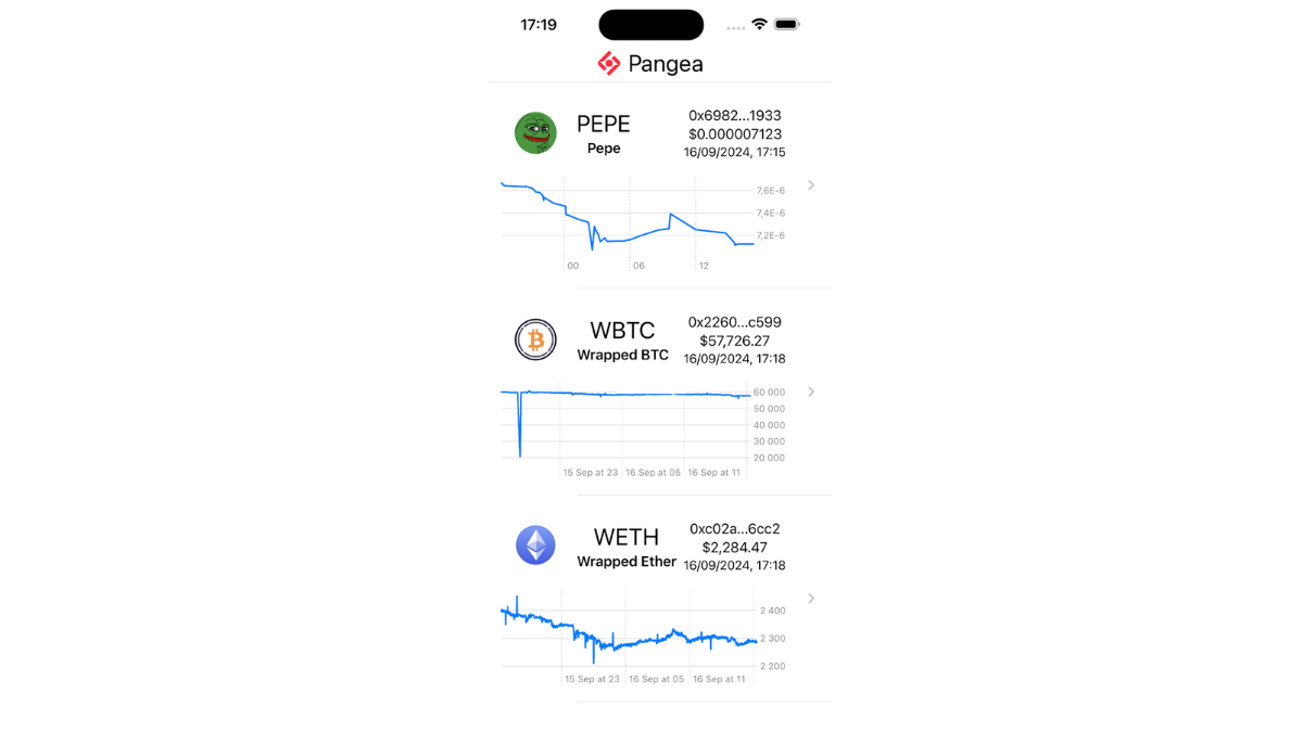
The market volume varies quite a bit among tokens. The line charts show how much more price movement WETH shows than PEPE.
The candlestick charts needed quite a bit of refinement before they looked decent. Because the candlestick prices are aggregated across all pools, outliers from low liquidity pools resulted in highs and lows that were way outside the open/close range. The code now ignores the highs and lows when it sets the y-axis range for readability.
Future versions of the aggregator could either filter out the unexpectedly high or low prices automatically or focus on them to see what’s going on. Maybe there’s a story there.
Code
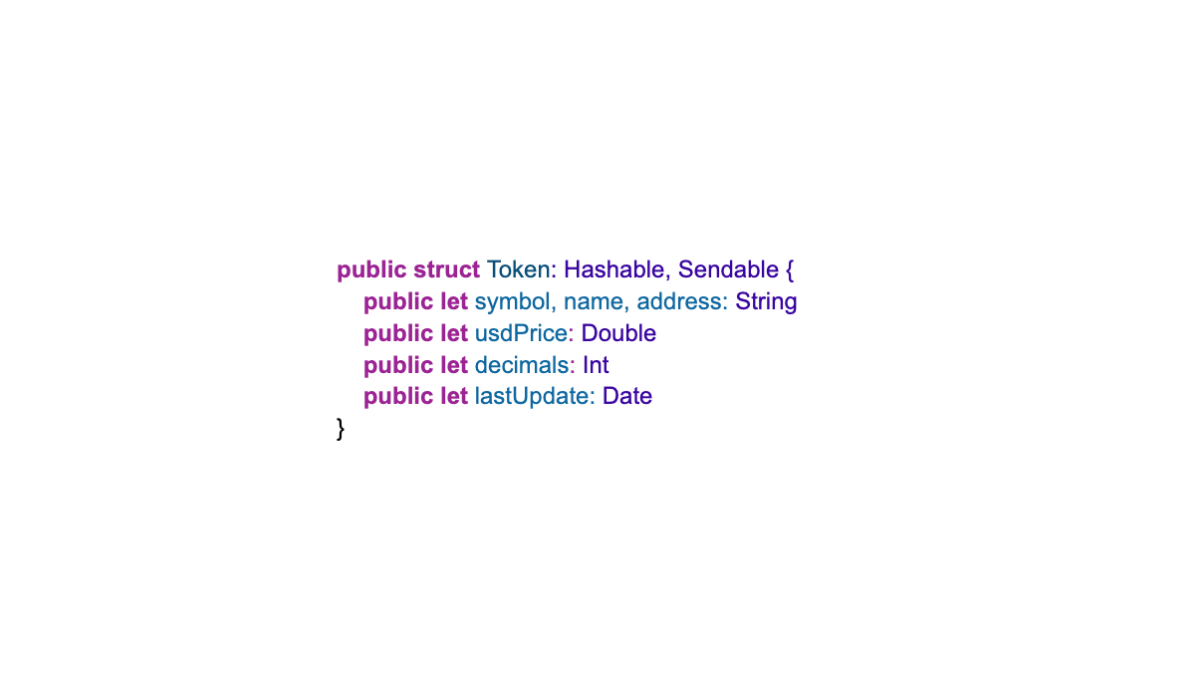
First, we created some data types. The first one is for the Tokens:
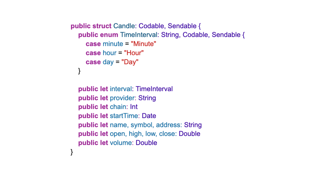
The second is for the pricing data, for making candlestick charts:
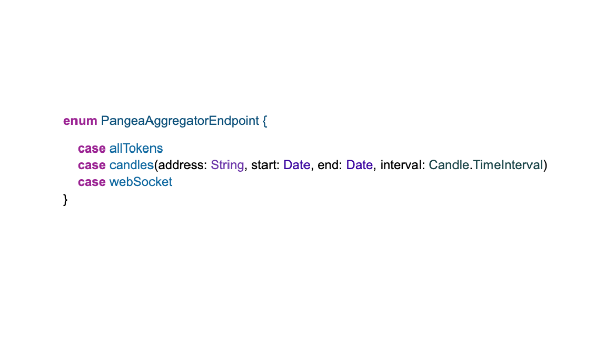
We also made an enum for the endpoints and the web socket:
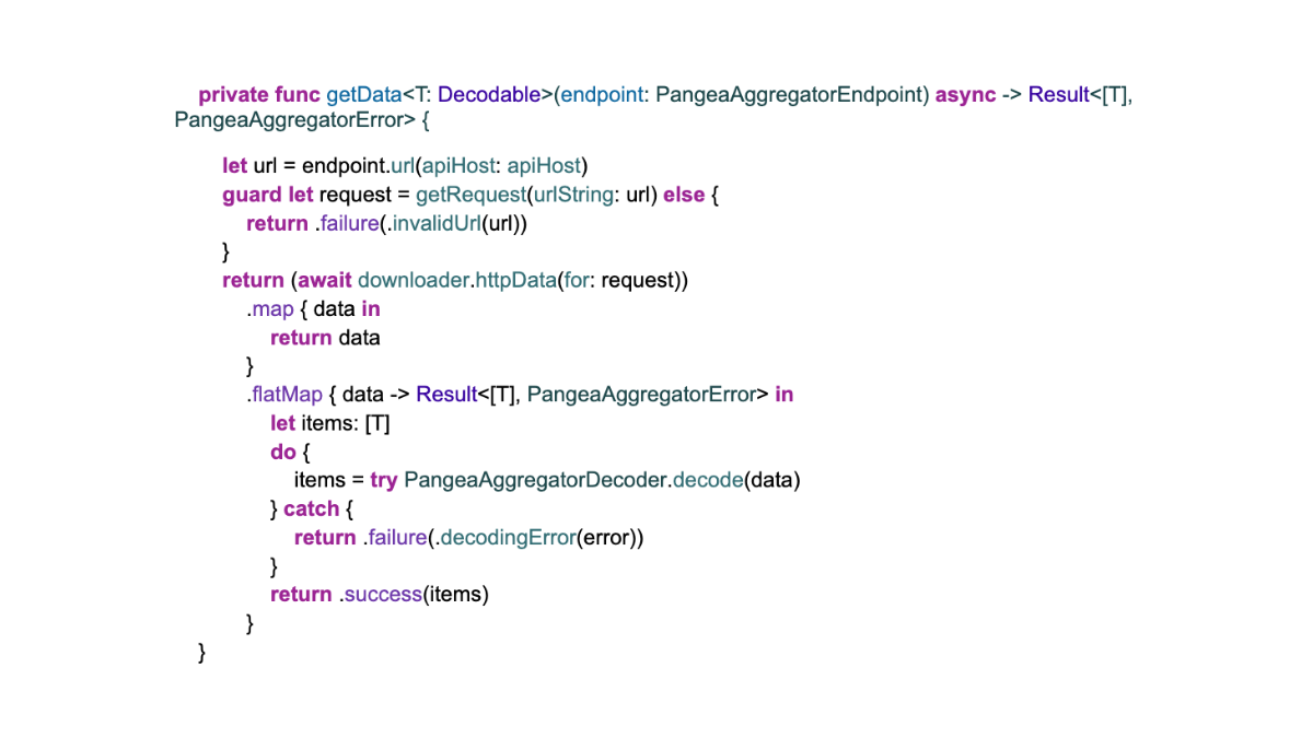
Once those were in place, we took advantage of Swift’s generics and made an all-purpose data consumer:
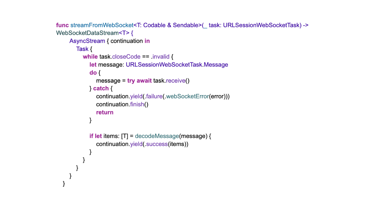
For the web socket, we have two data streams available, one for a price update, and one for updated candlestick prices (high/low/open/close). We created a URLSessionWebSocketTask and used this to create data streams for the correct data types:
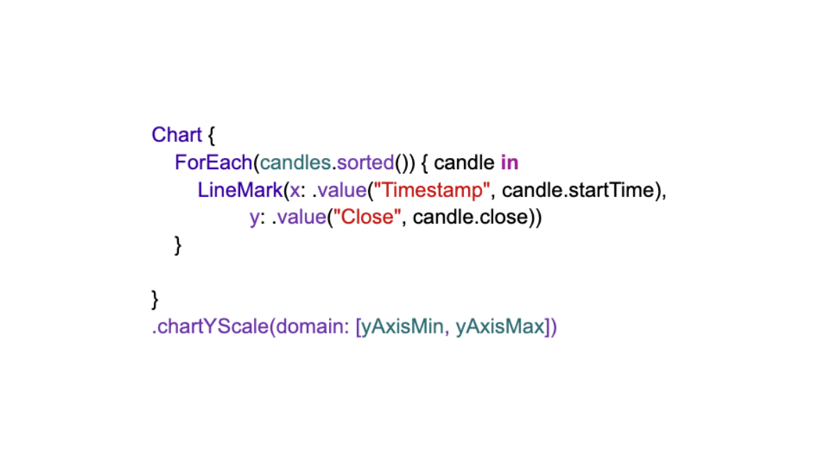
The line chart was created in SwiftUI using the native Charts library. It’s very straightforward. (The candlestick charts are more complicated):
In Closing…
This whole app took less than a week to build. Most of that was writing code to consume data from the Pangea servers, and that’s in its own repo.
So if you want to create your visualizations and uncover your insights, you can get started quickly and easily. (You will need credentials to access the data, which you can request here.)
If you have any questions, feel free to contact us!


